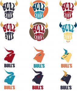
This fictional beef sticks brand was developed around a bold, bull-inspired theme, targeting consumers looking for a high-protein, pork-free snack. The concept focused on blending rustic appeal with visual impact and shelf presence. I created two distinct product lines—BULLS and Bulls Stix—each with a unique look and feel while staying true to the same brand identity.
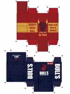
The BULLS version featured a deep blue color palette paired with a rough wooden texture, designed to evoke ruggedness and tradition. It was aimed at a more mature audience who appreciate strong, no-nonsense branding. In contrast, Bulls Stix took on a more energetic and youthful tone, with bold red and yellow hues that mimicked a bull’s hide. This version had a fiery, playful vibe for casual snacking, while still emphasizing the product’s boldness.
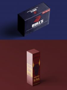
I designed the logo, packaging, and box dieline entirely in Adobe Illustrator, allowing for precision and flexibility across formats. Key product highlights like “100% Beef,” and “No Pork” were prominently featured, and each layout was tailored to the tone of its respective product. The project allowed me to explore the power of visual storytelling in packaging, and how design choices—like texture, color, and structure—can effectively reach different consumer segments under one cohesive brand.